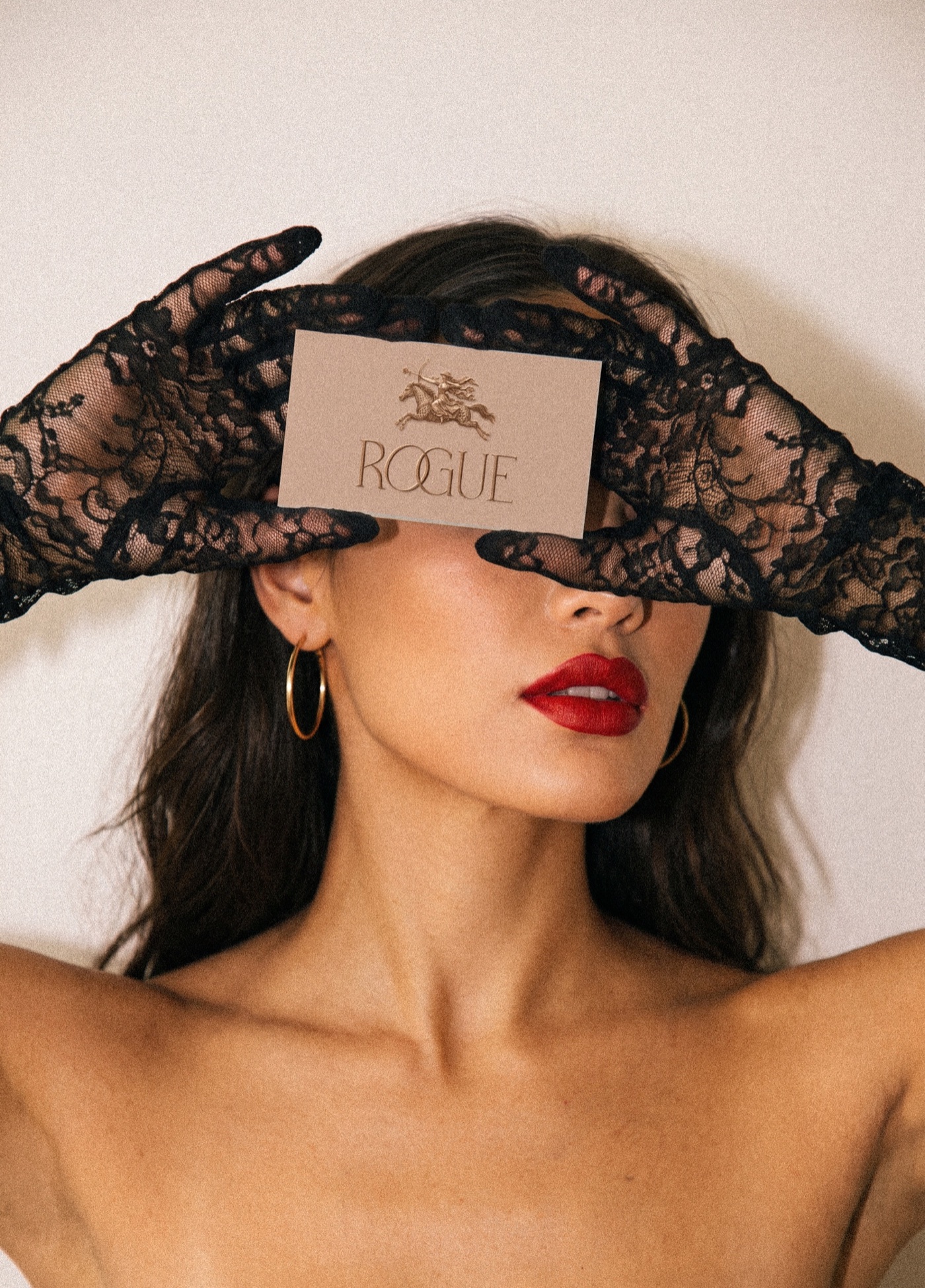
Rogue began as an instinctual case study, a visual identity for rogue.
A bold courageous danger in this posture, balanced by discipline and elegant curation.
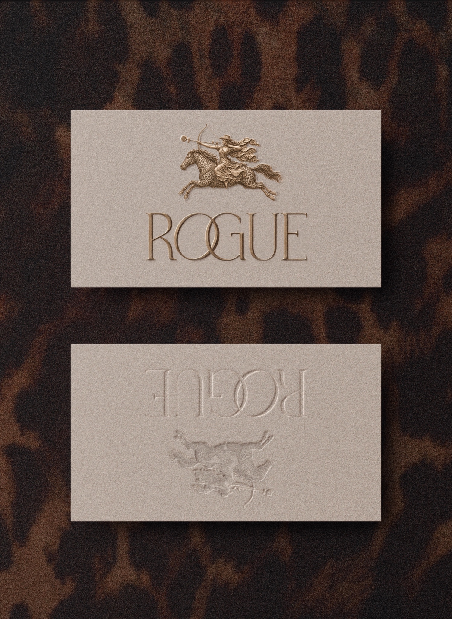
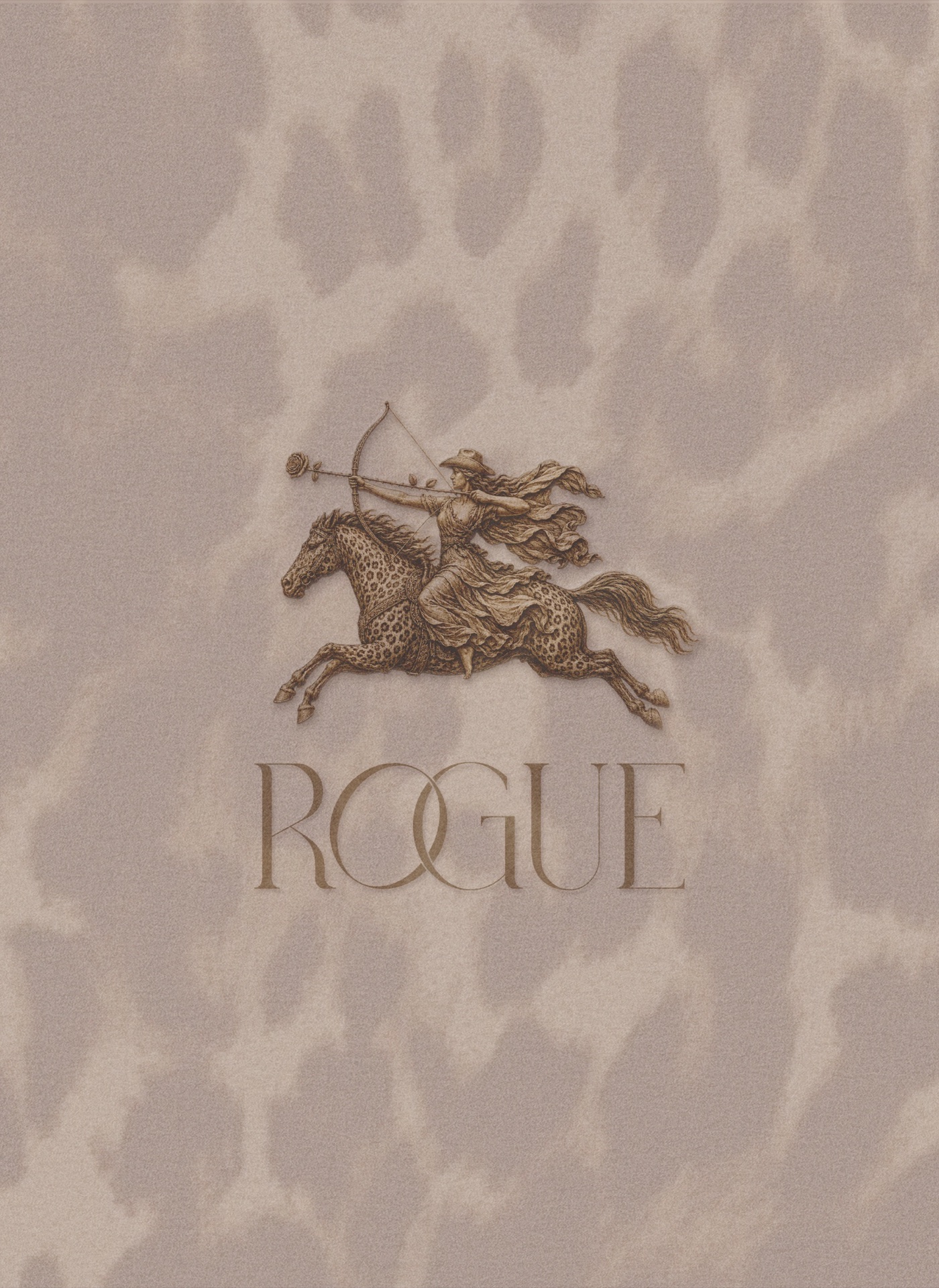
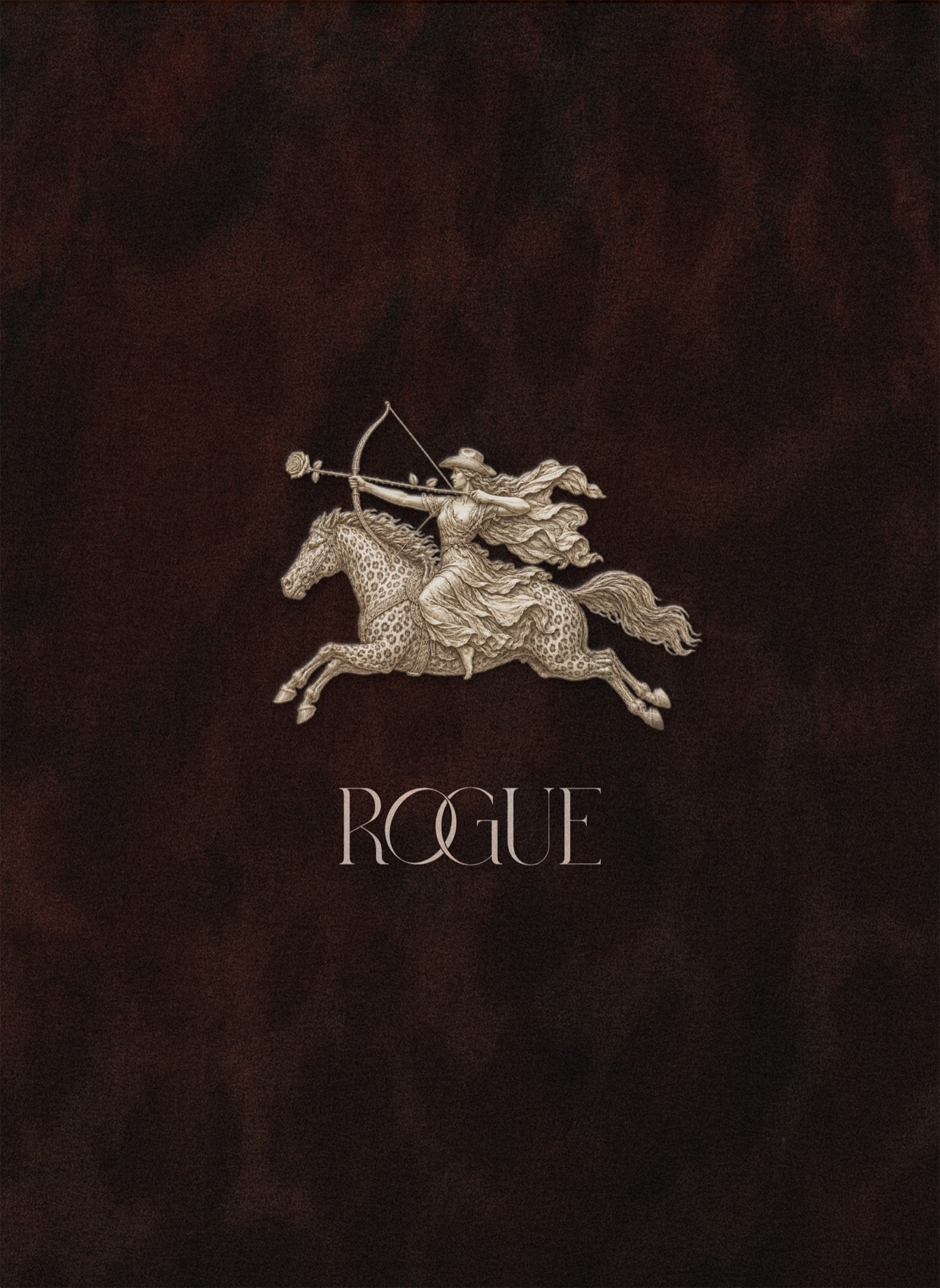
We created this visual identity centered on a heroine in motion, riding a leopard-spotted horse, drawing a rose arrow through her archer's bow. The style we curated is truly a nod to the enduring quality of heritage labels, the brands that have carved a legacy in fashion & accessories. Every great thing established has to go a little rogue to shoot your shot, especially if that is more flowers. And especially if your horse has leopard spots.
We absolutely loved creating the visual identity for this agency; a perfect mix of mythology and for a whimsical unorthodox approach to marketing and advertising.
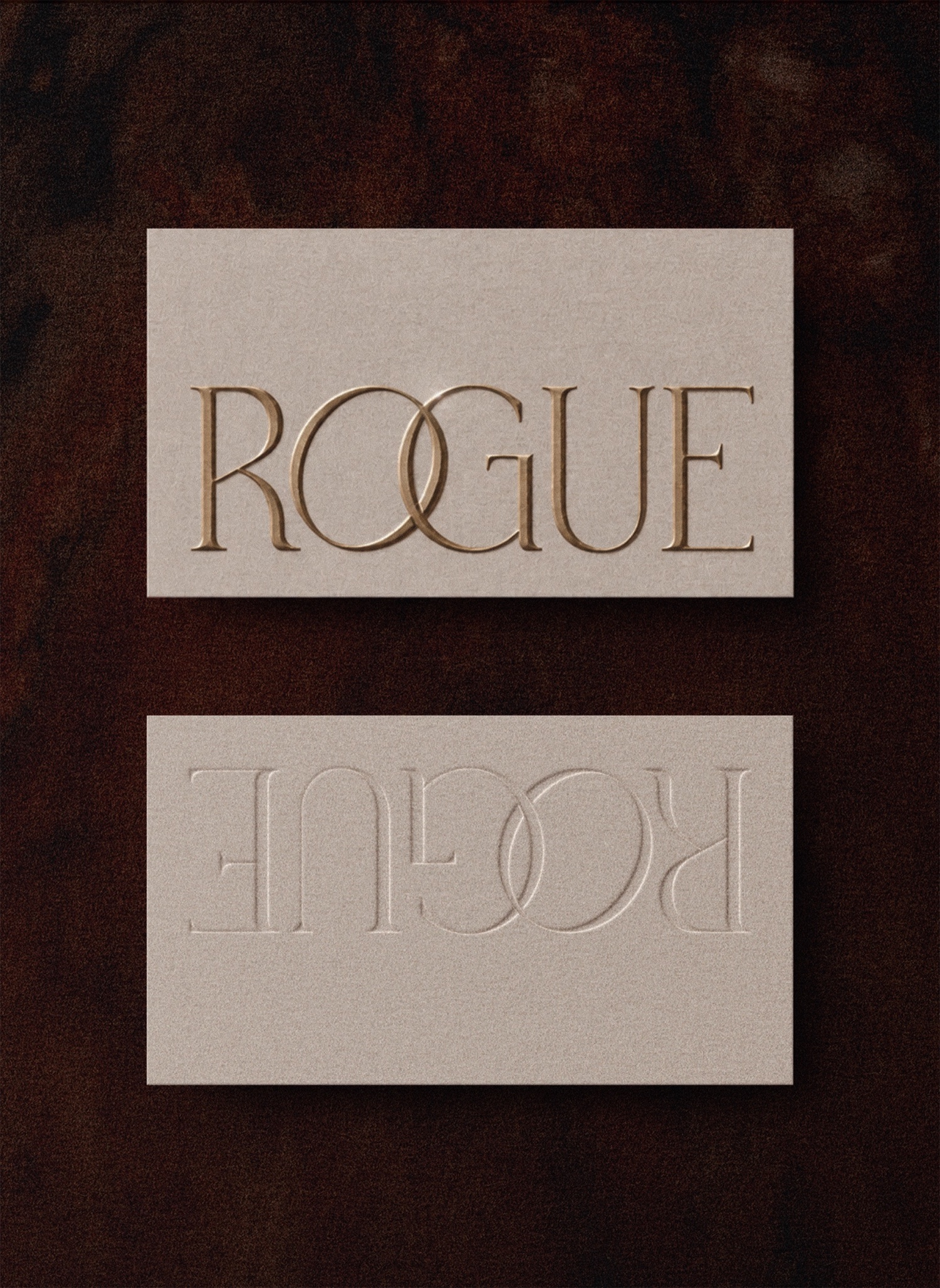
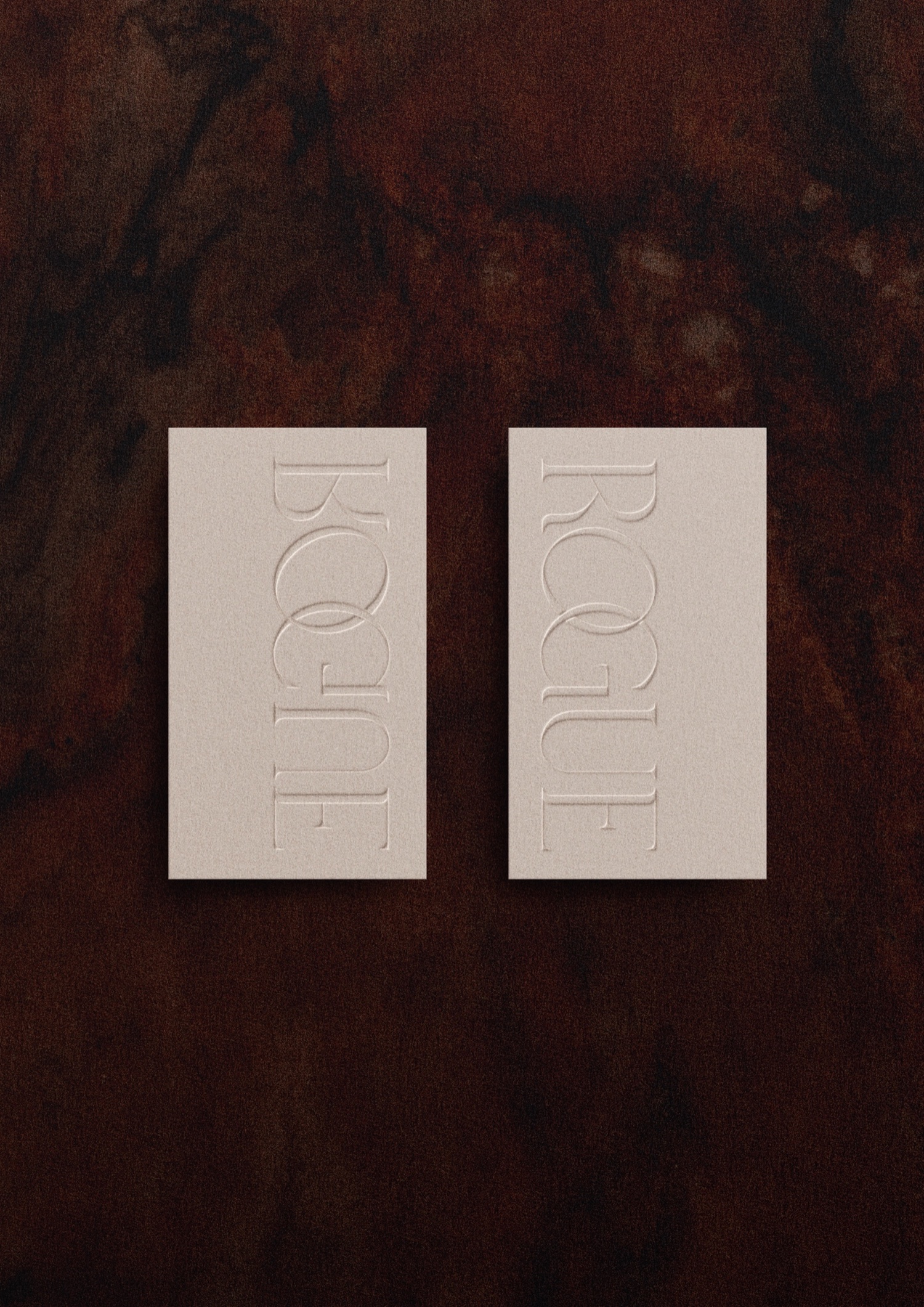
Rogue features a bespoke designed wordmark logo delivered for digital & print mediums; gold embossing, bespoke letterpress printing on unbleached paper cardstock. We chose a bold dark colour palette paired with an elegant typographic system, custom illustrations and textures of dark marble & leopard, of course.
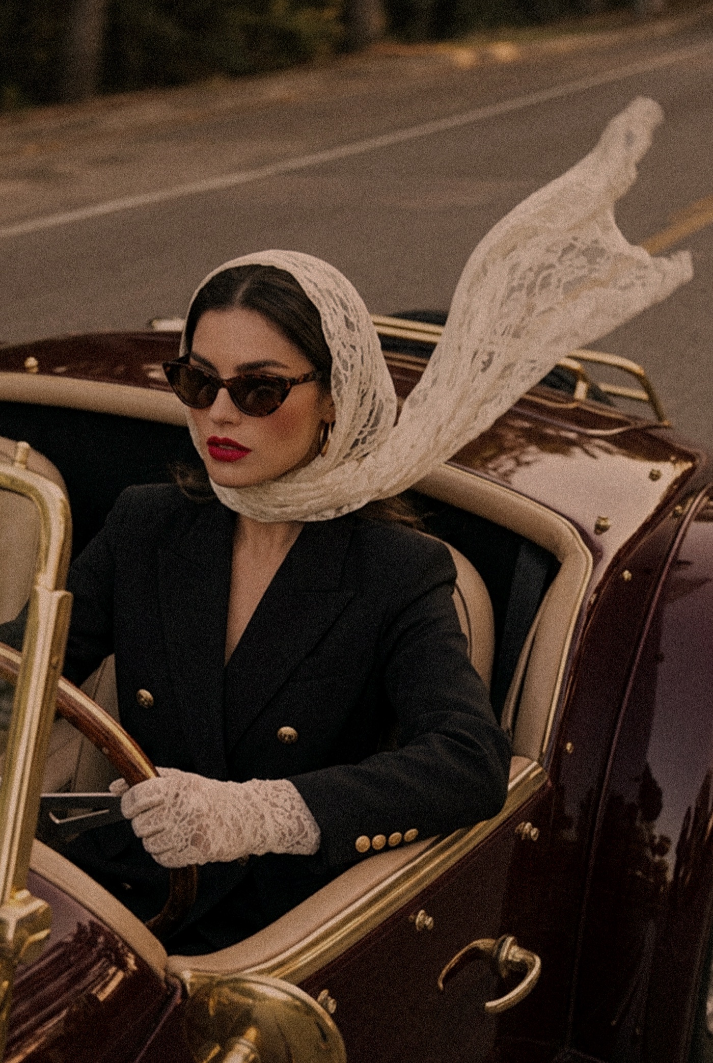
Rogue agency feels cinematic, daring and unruly. Exactly the kind of marketing you actually want to see.